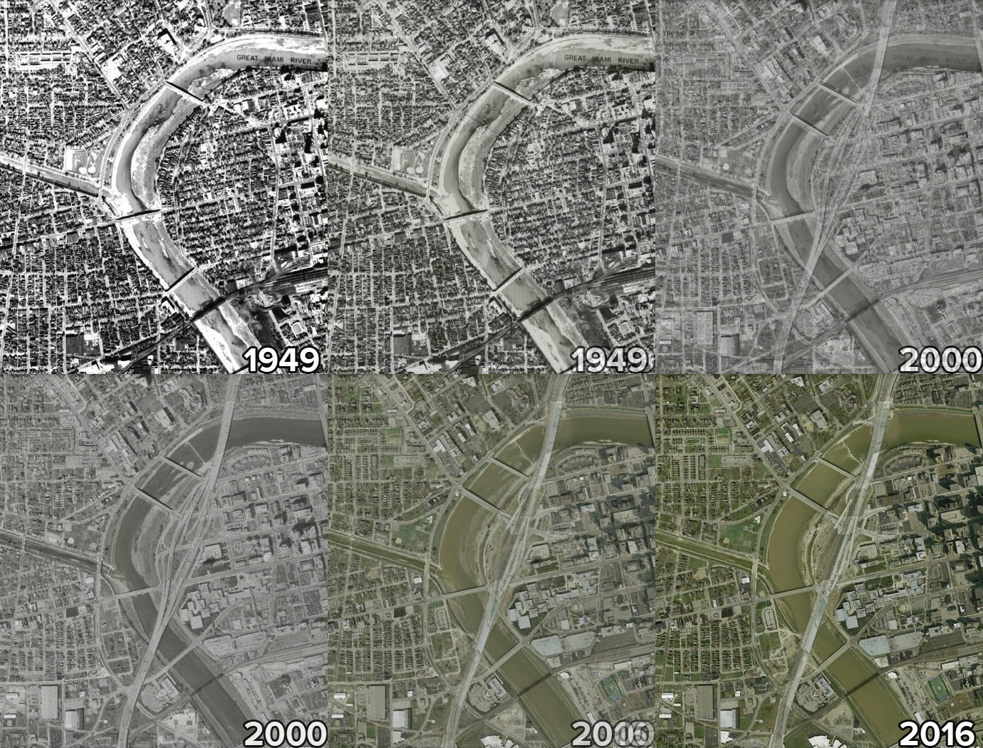
Changes to the
I-75/SR 4/Main St Interchange
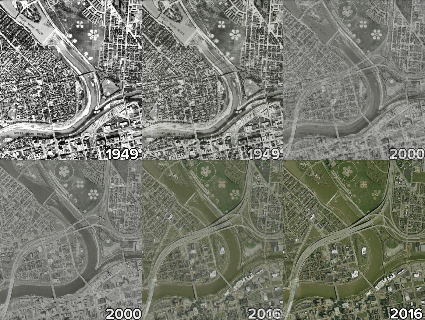
NB I-75 mainline curve improved from 45 mph to 60 mph and braided ramp from Main St to NB I-75 eliminates weaving. SB left entrances and exits eliminated.
Changes to the
I-75 Downtown Exits
Consolidated multiple entrance and exit ramps to a single interchange to improve weaving and merging. Eliminated left entrances and exits to improve lane continuity and driver expectations.
Changes to the
I-75/US 35 Interchange
Removal of the Albany Street ramps within the US 35 interchange footprint allowed the addition of a third through lane in each direction, one of the goals of the project.
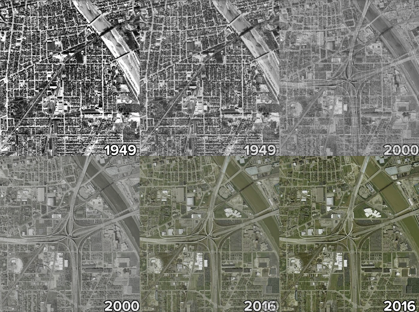
You can explore more of the changes in the Region on your own via the MVRPC Historical Imagery slider map web application.
Thanks to the Montgomery County Engineer’s Office for providing the aerial photography.
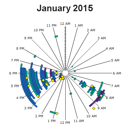
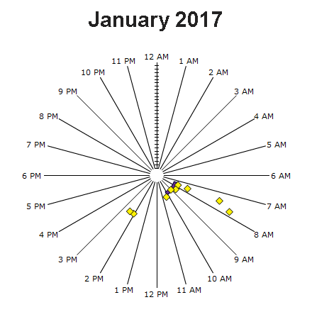
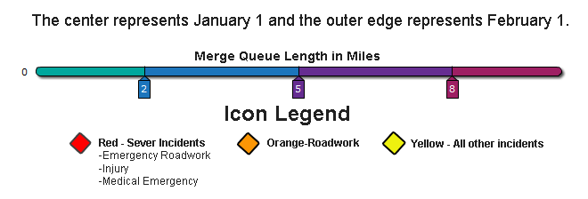
Traffic Backups Reduced
The images below illustrate the improvement in congestion as a result of the modernization project using speed data from INRIX. The January 2015 data shows routine back up queues between 2 and 5 miles, lasting 2 to 4 hours being most common in the afternoon peak periods. The January 2017 data, following the projects’ completion, shows sporadic incidents much shorter in duration.